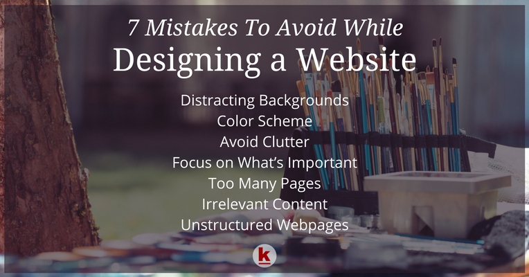
Website Design Do’s and Don’ts!

The dynamics of website designing are constantly evolving phenomena. Each year there are old and outdated trends which give way to the new ones. Web designers need to consistently keep themselves updated with website design trends so as to offer the best to their clients.
Listed below are certain website design mistakes to be avoided for better user-experience:
Distracting backgrounds
The design & background of a website should be kept minimalistic and simple especially if the objective is to provide information. Complex websites tend to distract the viewer from the main content. The simpler the site the easier it will be for visitors to manoeuvre and for you to maintain.
Color scheme
Enhance your web page with your company colors using a simple, flattering layout and design. Experiment with different website designs to find what works for you and your company but stick to your basic company branding color scheme. Choosing the right fonts and sizes also adds to the allure.
Avoid clutter
Too many pictures, details and content can end up making your website appear cluttered and may keep viewers away. Instead, focus on adding value and meaningful content to every web page that makes browsing through the website a good experience for users.
Focus on what’s important
If the main objective of your website is marketing a specific product then ensure that the home page does not deviate from that. The inner pages should be utilized to calls for action or any other information about the company.
Too many pages
Too many pages when creating a website only add clutter and leave the viewer confused. Viewers visit websites looking for specific content and the more informative web pages are, higher the chances of it being a success. The site should be made following the latest website design trends and should also be viewer-friendly and easy to surf.
Irrelevant content
Unnecessary content can make your website look unprofessional so avoid anything that is not relevant to your product or objective. It is imperative to attract the attention of the viewer and for this, the homepage should have the desired impact as this could be your only chance to make a conversion.
Unstructured web pages
The focus should not deviate from what is relevant to your business. It makes a big difference to provide information in a logical order for the ease of the viewer. So, pages should be well structured and interlinked.
Paucity of time? Inability to manage your website? Seek professional help? Contact us now!

RedAlkemi was created out of the desire to deliver measurable online success to its customer base. The founders consider themselves the alchemists who work with passion (Red) to develop processes (Alkemi) that turn a basic digital presence to a measurable and successful one, therefore the name RedAlkemi.
Yes, it’s possible! Motivated by innovation, RedAlkemists believe they can help take your business to the next level. In an ever-evolving online environment, our vision is to keep “Shaping a holistic digital presence for businesses through innovative processes.”
FOLLOW US ON SOCIAL MEDIA


Business Website | Search Engine Optimization | Social Media Marketing