9 Tips for Best B2B Landing Pages

Are you satisfied with your business’s landing page? Is the current landing page getting you enough conversions? Want to improve the conversion rate for your business? Well, you have landed on an appropriate blog, where we are going to discuss some tips on how to make a landing page that converts.
The landing page is the key page of a business website, which draws in the traffic and also witnesses the conversion rate. It is the landing page that drives the sales via the marketing funnel. There are some guidelines to be followed while you design a landing page. Try formulating a rough plan and analyze what is the aim of the landing page. Understand it’s benefits – this will help you frame the landing page, what should be on top of the page and what can be at the bottom.
Know how to make a landing page that converts, highlight the key takeaways for your audience, and let them know what is in it for them. Did we mention, that your landing page should be the hub of all knowledge, without forcing your readers to go to some other page for any information.
Tip to remember: If the landing page for your business leads to a form, make sure to keep the form simple and easily understandable for them to fill up. Asking for information is important, but know where to draw a line. Excess information might irritate your users to leave your site instantly.
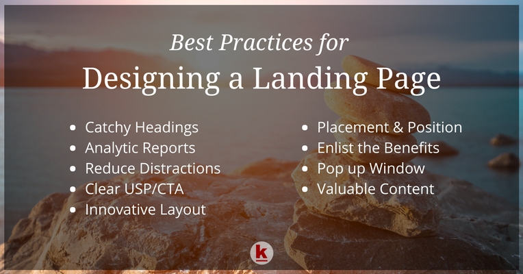
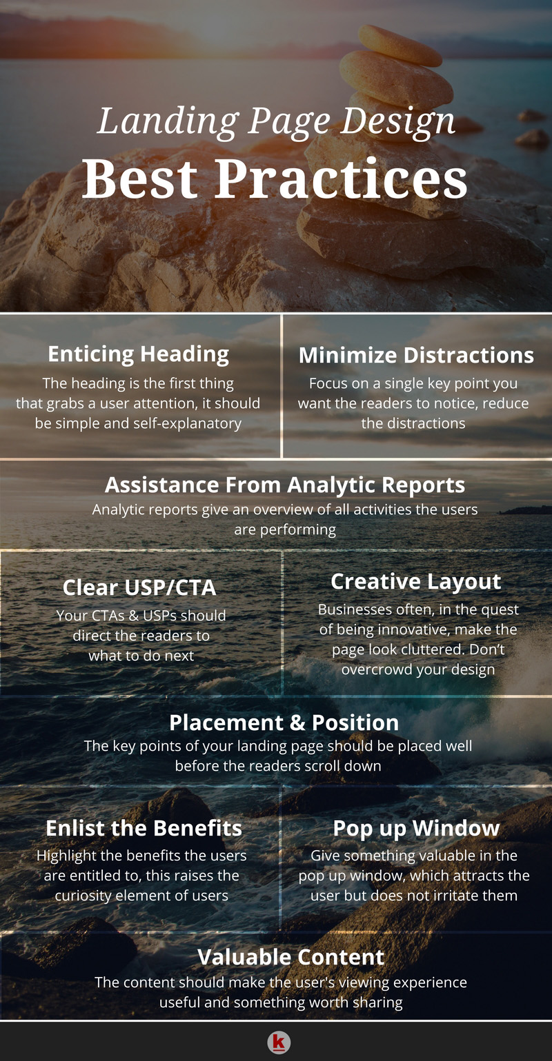
Here are some effective landing page tips:
Self-explanatory headings
A heading is what portrays the content within! Follow the KISS rule – Keep it short and simple.
The heading should be luring enough to grab a user’s attention such that the readers are attracted to your landing page!
Confuse your readers with some fancy keywords and they won’t wait to scroll down to get to your CTA or the key focus of your landing page.
Take a look at the best b2b landing pages, and you’ll see that the page uses simple words which are easily understandable by everyone, yet has all the information that they need.
Take help from analytic reports
If we go by the statistics, users spend less than a second to decide whether they want to read the page further or not. Users often don’t scroll through the whole page. The analytic reports give a clear picture of which strategy of yours worked well for your landing page.
Try changing the look and feel of your landing page and then see which design and placement draws in maximum users.
Diminish the distractions
What is the main focus of your landing page? Highlight just the key area and nothing other than that. Too much content might digress the readers from the main motto. Don’t add any such content that might be a distraction for your viewers.
Clear USP/CTA
The CTA (call to action) is the one that enables the user to know about your business and interact with your business. Precise and clear CTA’s have a better conversion rate.
The USP and CTA have to be the main focus of your content, to which you want to attract the online viewers. There is a slight difference between CTA & USPs, USP portrays the selling point where as a CTA converts their interest in your USP into the actions you want.
USP (unique selling proposition) makes or ruins your prospective customer. An online visitor takes only few seconds to judge whether they want to make a purchase from the business or not. Make sure to frame your USP in such a way, that a reader understands clearly what your business is all about & what the business has in store for them as a customer.
Creative & innovative layout
The design is the first thing that attracts a user’s attention. Keep it simple yet attractive. Businesses often in their attempt to be innovative, make the page look unreal and fake. So, don’t go overboard with designing to keep it clutter-free.
Images and graphics decide the look and feel of a page. Keep trying and testing by adding different designs to the page and see what looks the best and draws in maximum users.
Placement & position
If statistics are to be believed, CTAs should be placed on the first page, the reason being, not every reader will scroll down to the pages below where CTA is placed.
The CTA should be the first thing that a reader sees and explores it further before converting. The CTA is what tells the visitors what to do next.
This can vary from business to business, so you can test adding the CTA either on the top of the page or at the bottom of the page. Then, see which one has better engagement. You can also try reshuffling the colors of the CTAs and USPs just to ensure which draws in more users.
The landing page is the platform to highlight the key take away from your audience, so main focus should be on the USP and CTA!
Enlist the benefits
Understand a user’s psychology, why would a user even read your landing page, unless it has something they can benefit from.
Make sure to highlight the benefits that they are entitled to when they act on your CTA. Not all businesses are able to highlight the benefits that a reader is entitled to, which is one of the reasons that users don’t convert after going through the landing page.
Pop-up window
Pop-up window is definitely a good way to amp up your marketing, but this also hampers the user’s viewing experience.
If you want to add a popup window, try placing it somewhere that it does not distract the users. Make a pop-up window that has something valuable to offer but does not irritate the users.
Content
Is the content able to convey your message clearly to the readers? The gist of the content should be clearly understood so that the readers don’t have to think on the message you want to convey. Also, try testing different font styles and colors and evaluate which one attracts more users. Add relevant content only, don’t beat around the bush.
Give away relevant information, which they can benefit from, further making the readers stick to your landing page.
In all, keep testing as many changes on your landing page and we are sure you will get the best. Hope that we were able to enlighten you on some landing page best practices. If we missed out on some pointers, let us know in the comment section below!
Give your content exposure on the RedAlkemi blog! Submit a guest post with us.
