5 Bad Website Design Blunders to Stay Clear of

A business website is the true reflection of a business or an organization along with their mission and vision. Building a website is easy, the real challenge is to build a website that is easy to use and delivers a good user experience.
You might have come across some popular websites that were poorly designed. Do you recall your experience or first impression of that website? Probably not, and that’s because it wasn’t a great experience.
Characteristics common in websites having a bad design: cluttered content, inconsistent web pages, difficult website navigation etc. We will discuss these characteristics in detail below.
Users land up on websites either in search of information or in search of products. So, as long as you are able to provide a good viewing experience to the users, they will keep coming back to your website. The impression that your website leaves on the users visiting for the first time will decide if they will ever visit your website in the future.
Here are some website mistakes to avoid:
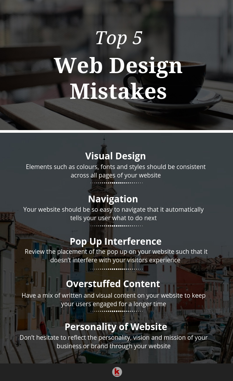
Inconsistent visual design
The interface that you choose for your website plays an important role in giving it a simple and easy-to-use look. If you’re selecting a website template, make sure that you maintain consistency across all pages of your website.
By consistency, we mean keeping a tight check on your fonts, colours and styles. Keeping these elements consistent across your website leads to a better user experience as compared to when a website makes use of multiple fonts, colours and styles.
Difficult navigation
How easily are users able to navigate your website? Does your website design automatically lead them to the next step you want them to take? Or are they having a tough time trying to figure out what to do next on your website? You must visit your own website as a potential customer/user.
For example, let’s assume that a user is visiting your website for the first time. Think of it this way, it should be easy for users to find whatever you want them to find. So, if you’re trying to get people to subscribe to your newsletter, make sure that option is easy to reach on your website.
Adding menus and submenus to your website makes it easy to scan and find relevant information. Another concern that users have is the liberty to search for anything relatable to your website. This is essential for any website, be it an eCommerce website or a business website. The better the viewing experience you give to the users, the higher chances you have of them coming back to your website.
Pop-up interference
How do you feel when you’re viewing or reading something on a website and are interrupted by a pop-up? We’re sure it’s annoying and you should be aware of the same while designing your own website.
If your website has a pop-up, we recommend getting rid of it. The placement of pop up is a common problem with websites struggling to attract visitors.
In some cases, however, using pop-ups can have a positive impact on your users as well as your business. For example, all e-commerce websites use timed pop-ups that appear after a visitor has spent a certain amount of time on the website. The ideal way to use timed pop-ups is to give a time-space of minimum 30 seconds and not more than 60 seconds. It is also recommended to use pop-ups at the end of the page once your user has completed reading the content on your website or webpage.
Overstuffed content
Is your current website stuffed with content that you may not even need there in the first place? Remember, no matter how well your content may be written, most users will only scan through the content on your website. So it’s a good idea to limit the number of words you want to use on your content and instead focus on the way the content has been presented.
It is always recommended to include visuals on your website. Adding visual on your website is a great way to keep your audience engaged. The ideal formula for a website page is content and visual in the ratio of 1:2.
Holding your visitors’ attention becomes difficult when you have long written content. In such cases, it becomes next to impossible to convey your message in an effective manner. Readers will never read all the content on your website. They will merely scan it.
Tip to remember: Write content in chunks, separated by headings and sub-headings such that scanning your content is easy.
Personality of website
As we mentioned at the beginning of the blog, a website is the true reflection of the offline business. This means that the personality of your business or brand must also be represented and visible on your website.
Your website should have a personality that is aligned with that of your business. It should also tell a story in the way that it has been designed. Don’t hesitate to reflect the personality, the brand mission and vision through your website. The bottom line is to tell the story of your business or business via your website.
Now that you know the web design mistakes that you’re probably making right now, it’s time to go make these changes on your website!
Want to publish your content on the RedAlkemi blog? We accept and publish guest posts too! Check out our guest post terms.
