How to Maximize Visitor Engagement with Your Website Header
You’ve spent hours crafting your website content, meticulously selecting images, and ensuring everything’s responsive. But there’s a piece of the puzzle you might be overlooking: your website header.
It’s the first thing visitors see, and it can make or break their experience. Just as you wouldn’t neglect a first impression in person, you can’t afford to neglect the potential of this converting powerhouse.
The fact that visitors usually abandon a website in less than 15 seconds if it fails to grab their attention only highlights the need for implementing a compelling header.
We’re here to help with this issue. Dive in and discover how to maximize the impact of your website header, ensuring visitors not only stay but are also compelled to interact.
Whether you’re launching a new site or revamping an old one, this guide’s got your back.
Set Yourself Apart from Competitors
With countless websites competing for attention, your website header needs to not only attract but also differentiate you from the myriad of others.
Here’s how to ace this:
- Identify your unique selling proposition (USP).
It’s essential to pin down what makes your brand or products different and better. It’s all about being different and better in a way that matters to your target audience.
- Craft a clear, compelling message.
Once you’ve identified your USP, condense it into a short, powerful statement. Ditch generic phrases. Be specific. Showcase what you offer that others don’t.
- Highlight your commitments.
If your brand stands for something significant, like sustainability, ethical practices, or exceptional quality, flaunt it! Your header is the perfect place to share your values and commitments.
Example
Vivion, an ingredients supplier, implements a website header that’s a masterclass in differentiation.
By clearly articulating their values and what they stand for, they effectively set themselves apart in a crowded market. When visitors land on their site, they instantly know what Vivion brings to the table that others might not.

Let’s break it down:
- Safe
This word immediately assures visitors of the quality and reliability of their products. In an industry where safety is paramount, Vivion clearly highlights this as a priority.
- Ethically Sourced
With increasing global awareness about ethical sourcing, Vivion’s clear stance aligns them with a socially conscious customer base.
- Contaminate Free
By emphasizing the purity of their products, they’re catering to a market that doesn’t want any surprises in their ingredients, reflecting their commitment to pristine, top-tier products.
Provide Ample Social Proof
As you strategize your website header, consider this: What can you incorporate that vouches for your brand’s value? Sometimes, it’s not just about what you say – it’s enough to show what others are saying about you.
Social proof – evidenced through testimonials, star ratings, and endorsements – is a robust tool that can immediately elevate trust and build rapport. By leveraging this genuine support, you engage visitors and enhance the chances of converting them.
Example
Dress Forms USA, a professional dress forms retailer, brilliantly employs social proof. They understand the weight of authentic voices and have integrated them seamlessly into their web design.
Their choice of featuring a sleek customer reviews flyout in the header immediately catches the eye.
Displaying genuine feedback from satisfied customers is their way of telling you they’re the best in the business.

But there’s more to it:
- Star Ratings
When visitors see a five-star rating prominently displayed, it instantaneously builds credibility. It sends a clear message: “Our products are top-notch, and our customers agree.”
- Written Reviews
It’s one thing to see a rating, but reading actual feedback provides context and depth. It humanizes the experience, making potential customers feel like they’re getting insights from peers rather than just a sales pitch.
Positioning these reviews right at the top of the page is a strategic move. Before diving into product listings or company details, visitors get a taste of the positive experiences of past customers.
Use Explainer Videos to Describe Your Product
Well-crafted text and striking images will always have their place, but nothing grabs attention quite like a video. Explainer videos, in particular, can work wonders in presenting complex products or services in a digestible, engaging manner.
Here’s how to perfect this approach:
- Keep it concise.
The key is to maintain a balance between informative and succinct. Aim for a runtime that’s long enough to convey the essential points but short enough to retain viewer interest.
- Humanize your product.
Explainer videos offer a chance to show your product in action. By demonstrating real-life applications, you make your product more relatable to potential customers.
- Evoke emotion.
Move beyond mere functionality. Create a narrative that emotionally connects, fostering trust and resonating with the viewer’s needs and desires.
- Prioritize quality.
Crisp visuals, clear audio, and smooth animations can make all the difference.
Example
GetSafe, a pioneer in medical alert systems, exemplifies the power of a well-executed explainer video. Their video, prominently featured on their website header, is a testament to the efficacy of visual storytelling.

Their approach allows viewers to quickly grasp the product’s utility. Also, by showcasing scenarios that potential users can relate to, GetSafe fosters a sense of understanding. Viewers can easily envision themselves or their loved ones using the product.
This strategy is a shining example of how to seamlessly integrate product functionality with emotional resonance. Explainer videos not only educate but also connect, making potential customers more inclined to trust and invest in your solution.
Master the Magic of Negative Space
With so much visual clutter around us, the appeal of simplicity can’t be overstated. Negative space isn’t just an absence of content. It’s a potent design element in its own right.
By consciously embracing and leveraging negative space, you can guide user attention, enhance comprehension, and elevate the overall user experience.
Here are a few tips for nailing this design principle:
- Prioritize clarity.
Overloading your header with too many elements can be overwhelming. Negative space offers breathing room, ensuring key messages and CTAs stand out.
- Enhance focus.
The clever use of negative space can act as a spotlight, drawing attention to your site’s most crucial elements – be it a value proposition, a product image, or a CTA.
- Foster a premium feel.
Often, minimalist designs evoke a sense of elegance and sophistication. A clutter-free layout can elevate your brand’s perceived value.
- Optimize for mobile.
With increasing mobile traffic, it’s essential to ensure your design is finger-friendly. Ample negative space can make touch targets easily accessible and prevent accidental clicks.
Example
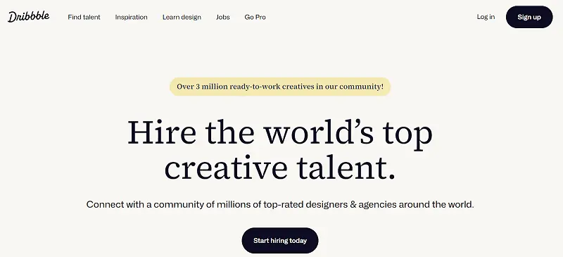
Dribbble, the renowned hub for web and graphic designers, crafted its header with the philosophy of “less is more” in mind.

Key aspects of their approach:
- Streamlined Messaging
Set against a white backdrop, Dribbble’s header crisply conveys the platform’s value proposition, free from any distractions.
- Prominent CTA
With ample space around it, the central Call-to-Action naturally draws the eye, encouraging user interaction.
- A Feel of Refinement
The minimalist approach enhances functionality and exudes a sense of sophistication, aligning with the platform’s target audience of designers and creatives.
Command Attention with Bold CTAs
CTAs are the beckon that leads visitors towards the desired action, be it signing up, purchasing, or just learning more.
To ensure your CTAs don’t get lost in the shuffle, they need to be bold, clear, and compelling.
Here’s your roadmap to crafting standout CTAs:
- Go big and bold.
Size and color matter. Your CTAs should be easily distinguishable from other elements, ensuring they grab attention right away.
- Clarify your message.
Be concise and direct with your CTA text. Ambiguity can deter users. Instead, use actionable verbs that clearly indicate what’s expected.
- Position strategically.
Place your CTAs where they’re most likely to be seen and clicked. Common spots include the right corner of the menu bar, the center of the page, or even a sticky button that stays visible while scrolling.
- Test and optimize.
What works for one site might not work for another. Regularly test variations of your CTAs (color, text, position) to see which resonates best with your audience.
Example
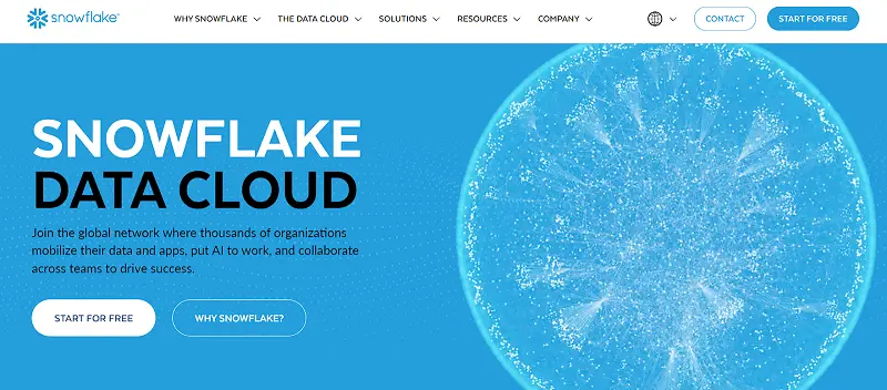
Snowflake, a leader in cloud-based data solutions, exemplifies the art of impactful CTAs. Their website header doesn’t shy away from guiding visitors decisively.
By offering two distinct CTAs – “Start for Free” and “Why Snowflake?” – the company caters to different user intents. Those ready to dive in can begin their journey, while the more cautious visitors have a route to learn more.

Each CTA is direct and to the point. “Start for Free” offers a no-risk proposition, while “Why Snowflake?” invites users to discover the unique selling points of their service.
This approach is a lesson in the power of clarity and choice. By presenting distinct paths clearly and boldly, Snowflake ensures that visitors are never left wondering what to do next.
Spotlight Your Core Product Functionality
Most users want to immediately understand the value a product or service offers. By placing a core functionality of your product front and center, you can instantly showcase its benefits, enticing visitors to delve deeper.
Nail this approach by doing the following:
- Show, don’t just tell.
It’s one thing to describe the features of your product, but letting users try it out for themselves can be a game-changer. A hands-on experience can be more convincing than any written testimonial.
- Make it user-friendly.
Ensure that the feature you’re highlighting is intuitive. Even first-time visitors should be able to understand and use it without any hurdles.
- Highlight the value.
The chosen functionality should represent the core value of your product. It should answer the user’s primary question: “What’s in it for me?”
- Use it as a stepping stone.
This immediate taste of your product can be a strategic gateway to introduce users to more advanced or premium features.
Example
VirusTotal, a trusted name in online security, exemplifies this tactic with finesse. Rather than just talking about their malware detection capabilities, they’ve placed their free virus scanner prominently in the website header.
By offering immediate access to the scanner, visitors can instantly see the efficiency and thoroughness of VirusTotal’s tool.

Additionally, providing a core service for free not only showcases confidence in their service but establishes trust as well, as users can verify the tool’s effectiveness firsthand.
After users witness the scanner’s capabilities, they’ll be naturally intrigued about the advanced protection and features that premium services might offer.
VirusTotal’s strategy is a testament to the power of interactive engagement. By letting visitors experience a cornerstone of their service from the get-go, they effortlessly transition them from curious bystanders to potential premium users.
Final Thoughts
Crafting a captivating website header goes beyond the aesthetics. It’s a strategic move that can significantly boost user engagement and conversions.
From the elegant simplicity of negative space to the interactive attractiveness of core functionalities, every element plays a pivotal role. By embracing these tactics – be it through bold CTAs, compelling explainer videos, or firsthand product experiences – you’re curating a journey that guides, resonates, and, ultimately, converts.
As you venture forward, remember to keep your user at the heart of every design decision, and success will follow.