How to Design A Logo – All You Need To Know

A strong logo is a vital component in a brand’s success. Since the corporate structure has expanded and evolved over the years, so has the need for distinct identification. Today, when so many forms of logo exist, it is important for you to make your logo distinctive and meaningful.
In this blog, we have listed down 10 steps to help you design a winning logo for your brand. Let’s embark on the journey of designing your logo.
Step 1 – Understand Why You Need A Logo?
A man’s desire to claim ownership is perpetual. People have used marks to claim ownership of things for a long time. With the industrial revolution, the value of identification increased and the role of a logo also changed. A logo is not a mere identification mark, it must talk for your brand and convey a clear message to your audience. Your logo is the first impression of your brand and it determines how people interact with your brand for the first time.
Step 2 – Start With Your Story
Before you begin with anything, you must ask and answer these basic questions “Who are we?” “What do we do and how we do it?” “Who is the audience and what is needed?” Your logo should grow organically from the answers to these questions. In addition to the previous questions, ask yourself, “what makes your brand different?” It will lead you to figure out the unique elements of the brand that could be used in your logo. You can also list 3 to 4 words that describe your brand the best. Once you have a clear idea of your brand’s personality and core values, it will be easy to design a logo accordingly.
Step 3 – Look for Design Inspiration
Everybody has their own way of seeking inspiration. Some people like to brainstorm with others, some like to sketch and some dive into the pool of already existing logo designs. You can search for a few popular design-related hashtags on Instagram – #logo, #logodesigns, #logodesigner, #graphicdesign, #graphicdesigner or Pinterest is also a wonderful platform to explore. While it’s good to have multiple ideas to take inspiration from, you must avoid analysis paralysis. When looking for inspiration, you might get stuck over-analyzing a bunch of ideas and it will become difficult for you to make a decision. Once you’re done exploring, think about what made your favorites so memorable.
Step 4 – Select The Right Type of Logo
If you are not sure where to start with your logo design, you can begin by deciding the right type of logo for your brand. There are 5 basic types of logo you can choose from:
Wordmark
This is the simplest type of logo that uses the brand name in plain text. Famous examples include the logos for Disney, Mobil, Visa, Google and Facebook. You can choose this type of logo if you want to keep it simple and straightforward.

Source: Wikipedia
Lettermark
Also known as a monogram logo, a lettermark logo also uses text but just the initials of your brand, instead of the full name. Famous examples include the logos for Cable News Network (CNN), Home Box Office (HBO), the National Aeronautics and Space Administration (NASA) and Procter & Gamble (P&G). Lettermarks can be a good choice if your brand name is difficult to pronounce. But make sure that it is visually distinctive and easy to recognize.

Source: Fandom
Brandmark
Also known as a pictorial mark, a brandmark has just an image, icon or symbol that represents your brand. Famous examples include the Half Bitten Apple, the Nike ‘Swoosh’, the Twitter Bird and the Instagram ‘Camera’. Using only a symbol to explain your brand has obvious advantages. It is easy to remember and it can be instantly understood. The trick is to be clear about what it means, make it retable to your brand and simple for the audience to understand.

Source: Wikipedia
Combination Mark
As the name suggests clearly, it is a combination of the wordmark and symbol. Famous examples include the logos for Pizza Hut, Xbox, McDonald’s, Microsoft and Domino’s Pizza. If you choose to design a combination mark, you can convey a visual idea of your brand and make it clear what it’s called.

Source: Wikipedia
Emblem
An emblem also involves both text and symbol, in this case, the text appears inside the symbol. Famous examples of emblems include the logos for Starbucks, Burger King and the NFL. These types of logos are more flexible as their elements are difficult to separate. If you want your logo to be a bit authoritative and authentic, you can go for an emblem.

Source: 99designs
Step 5 – 5 Principles of Effective Logo Design
Remember these 5 principles while choosing the elements for your logo:
Simplicity
Let your logo be simple and direct, it is powerful. Many logos fail from their own cleverness or overproduction.
Memorable
Your logo is a shortcut, a visual language that must be quickly recognizable and memorable.
Timeless
Multiple personalities interact, industrial trends evolve, and society at large is constantly shifting. Your logo, however, must remain a clear expression of your brand over the years and must last the test of time.
Versatile
You will want a logo that looks good no matter where it is placed. Make it easy to adjust and resize to avoid inconvenient limitations.
Appropriate
Make your logo fit for the purpose of your brand and appropriate for the intended audience.
Step 6 – Choose The Right Typography
Type defines the tone of voice of a brand. You must contemplate what will be the best fonts for your brand logo. There are 4 basic type styles you can experiment with:
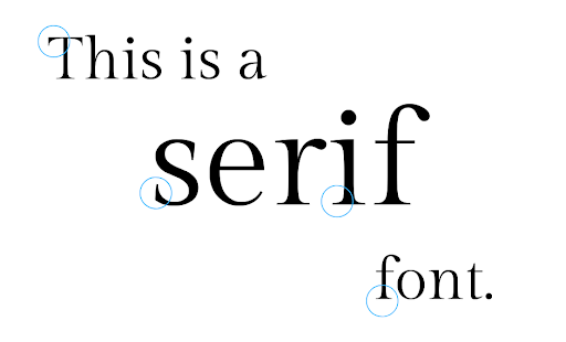
Serif
In typography, serifs are the short lines stemming from and at an angle to the upper and lower ends of the strokes of a letter. Serif fonts give a bit of an old fashion vibe, often associated with history and tradition. They work the best with vintage, classic or elegant designs.

Source: Post
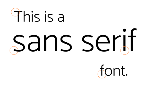
Sans Serif
This is a typeface without serifs. Sans Serif fonts are said to be modern, approachable and clean. If you have a modern brand, you love minimalism and want to convey a sense of innovation, Sans Serif is the right font for your logo.

Source: Post
Script
Derived from handwriting and calligraphy, these fonts are whimsical and versatile. They can be used by both casual and formal brands. While formal scripts give off a feeling of luxury, romance, and passion, Informal scripts can give your brand a modest vibe. You can use scripts to emphasize words and short phrases, especially if it’s a word you want the people to pause at.

Source: 1001Fonts
Decorative
Decorative or display fonts are often tough to categorize. They can be very tricky because they are diverse when it comes to style but generally difficult to read. Though, you can incorporate single characters into a logo. You can also create a typeface set specially for your brand.

Source: Hypefortype
Step 7 – Choose The Right Color Scheme
Choosing the right colors for your logo is important. A study shows that color can affect your users’ mood. So, when you choose a color scheme for your logo, ask yourself, “what is the reaction you want out of your customers”? and “do they enhance your brand’s recognizability”?
3 Things to remember when selecting colors for your logo:
Colors Used by Competitors
Make sure to do your research to know what colors are most used by your competitors. You would want to choose the colors that make your logo stand out.
Your Brand Essence
Your logo colors will end up at every place where a user interacts with your brand. So it is important that it preserves the essence of your brand and conveys the right emotion and vibe.
Choose The Colors That Work In All Situations
Try to choose the colors that look good not only on paper but also at other places like your website, application, social media platforms, print accessories and digital advertisements.
If you choose to use multiple colors in your logo, it’s important to be cautious about the colors you use together. These are a few online tools that can help you select the right color scheme quickly – Canva’s Color Palette Generator, Paletton, Coolors.
Step 8 – Create Multiple Rough Versions
Now that you have all the elements in place, it’s time to put it all together until your vision becomes reality. Design involves a lot of trial and error. You might spend a whole afternoon experimenting and have nothing at the end of the day. But on the other side is the knowledge that helps in narrowing down your options, means less work tomorrow.
These days, hardly anyone uses pencil and paper to sketch out their ideas. By not drawing out your logo design ideas, doodling, or sketching, you lose a critical component of thinking and ideation. Try to draw your logo design ideas freely and enhance your out-of-box thinking.
If you’re not much of a sketcher, you can use simple web-based applications to create logo variations in minutes. These help you combine various design elements like icons, colors and fonts with ease. The most preferred ones are – Logo Maker, Canva, Designhill Logo Maker.
Step 9 – Get Feedback and Polish Your Design
Feedback is incredibly important to the creative process because it’s the best credible method to test your ideas. You can ask for feedback from nearly anyone, but it’s better not to rely on a single person. Here are some questions you can ask when getting feedback:
- What’s the first thing that sticks out to you?
- How would you characterize my brand?
- What do you remember most about my logo?
- Is there anything that confuses you?
- What is that one aspect of the design you want to remove?
You can also use Logo Grader to perform a quick (and painless) self-test on your new or current logo, scoring yourself based on industry best practices and ultimately see how your logo stacks up. Once you are done experimenting and have got various feedbacks, modify and polish your design accordingly.
Step 10 – Important Logo Design Dimensions/sizes
Blurry logo images will do nothing for your brand, but will undoubtedly tarnish it. While you design your logo, save your image in multiple file formats, use separate versions for everyday projects and graphics editing. That way, you can easily choose the best logo size for different applications. Some important logo dimensions are as follows:
Logos for Website
Favicons:
16px x 16px
32px x 32px
48px x 48px
Website Horizontal
250px x 150px
350px x 75px
400px x 100px
Website Square or Vertical:
160px x 160px
Conclusion
The idea to design your own logo may have seemed like a daunting task in the beginning, but now, with a better understanding of the design principles and the steps involved in the process, you’re equipped to create the best logo design for your brand with confidence.
If you are looking for a professional logo design, get in touch with us here.