Best Logos Of 2021 And Why They Work

Logos play an essential role in the successful branding of a company. 60% of consumers avoid brands that have odd, unattractive, or unappealing logos, regardless of whether they received good reviews. Hence, the design of the logos is of primary importance to build trust value, and unique identity among the prospects.
Although a logo design doesn’t have to be complicated to be eye-catching. Simple and minimalistic designs can work their magic just as effectively. A good logo simply connects the consumers with the idea of your brand so that it gets stuck in their minds. Let’s take a look at some of the best logo designs online–
1. House Of Cocktails

Source: DesignRush
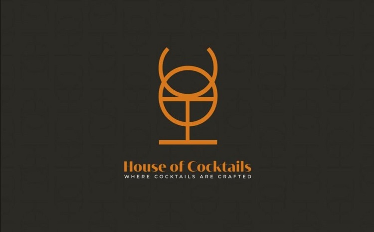
House Of Cocktails, a cocktail bar from Byblos Lebanon has precisely incorporated the classy experience in their minimalistic design. Their logo is only made up of typography, i.e. “H”, “O”, and “C”, the acronym of the brand’s name. The arrangement of typefaces in innovative ways can play a key role to determine the intent of the company. As we can see in this case, the monogram has been used to highlight the image of a cocktail glass that rightly grabs the viewer’s attention.
Their typography is not just limited to giving a classy feel to the brand, but it also invokes the ancient history of Byblos as they resemble the Phonecian alphabet or Lebanon’s traditional decorative pattern.
2. Eden Healing

Source: DesignRush
It is a natural skincare brand that focuses on healing by herbs. If we take a look at the logo, it is a simple design, mainly highlighting the image of mortar and pestle. The connotation of mortar and pestle is very well known, it has been used for healing since ancient times. The idea of the logo is to invoke the idea of natural healing in the minds of its consumers. The use of products with the goodness of nature was never out of vogue. So this innovative logo design effectively reflects the message of the brand.
3. Shakesphere

Source: DesignRush
Instead of using an alphabet conventionally, Shakesphere went a little awry and distorted the letter “S”, which gives more dynamic power to their logo. Shakesphere is a “revolutionary protein shaker for fitness enthusiasts and gym-goers” as mentioned on their site. Thus, their logo encapsulates the swiftness and energy of the fitness world.
Another innovative thing about their logo is the use of negative space, (negative space is the white space present in the design of the logo) that is used to define the shape of their capsules.
4. Delish

Source: 99Designs
Delish is another example of effective use of white space or negative space to provide a setting for the company’s logo and decide the focal point. The creative use of blank space can add an extra dimension to the logo and still not look cluttered.
5. Inteller

Source: Dribble
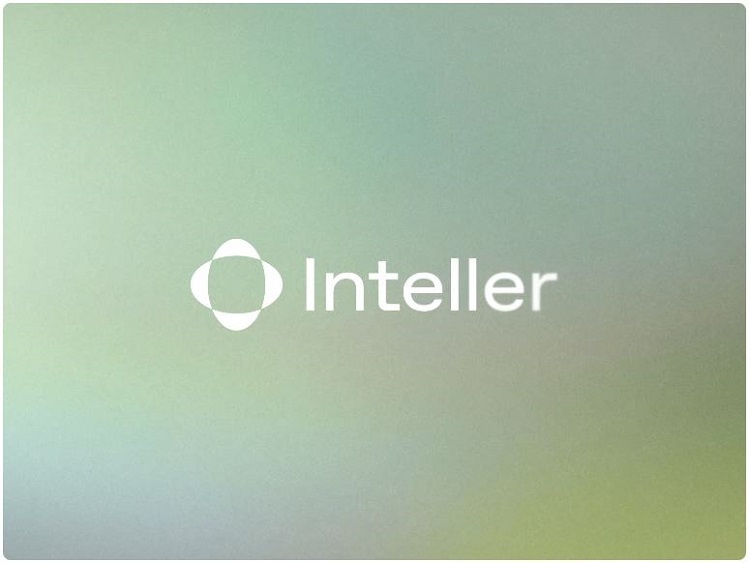
Inteller is an optical engineering company that focuses on the research and manufacturing of opticals. The designer has experimented with the blur effect on this logo design to provide fluidity to the text and to determine the company’s intent using a clever approach.
Sometimes clear readability of the text is not enough. Experimenting with various effects can become an effective medium of channelizing the motive of the company.
Conclusion
These logo ideas work due to their simplistic nature and their innovative use of effects and techniques. A good logo does not always have to be complicated but it should be innovative and creative so that it conveys the intent of the company in the best possible manner.
If a prospect senses a connection with the brand, it would be easier for them to develop trust in the brand. If you have any queries regarding logo design, please feel free to ask in the comments below.
If you are looking for a professional logo design, get in touch with us here!