How to Improve Your E-Learning Business with Better UI/UX Solution

E-learning was initially considered as a permanent storage for information on topics related to student academics. However, with the increasing demand for digital training and competency, e-learning is now a mainstream education method in various sectors.
Startups and enterprises use e-learning to train their employees. Schools and colleges use it to educate their students. The dominance of e-learning is also evident in the healthcare and retail businesses.
To ensure that your users are comfortable with the interface you provide, it’s vital to have a compelling UI/UX for your e-learning platform. User experience determines whether the user would prefer learning from your platform or not. As per a report by Toptal, 88% of the internet users would never return to a website if they encounter a bad user experience.
It’s a no-brainer to provide a stellar user interface to the visitor, right?
Let’s explore 5 of the best ways to improve your e-learning business with better UI/UX solutions.
1. Start with Planning and Research
E-learning platforms are growing rapidly on the industrial scale. An in-depth research on the educational domain that you’re targeting will give you a good head start.
To offer the best user experience, you need to study various UI design examples. Combine it with brisk research of your competitors and list down the “must-have” features along with the ones that you want to avoid.
Think from a user’s perspective to better understand the optimum UX that your e-learning venture should have. Make use of flow charts, datasheets, and statistics to ensure that visitors get a seamless journey throughout their on-page time.
When you have a clear roadmap of the desired UX design beforehand, the execution phase becomes a lot easier. It reduces mistakes, saves time, and eventually benefits you on the financial forefront as well.
2. Don’t Exaggerate the Design
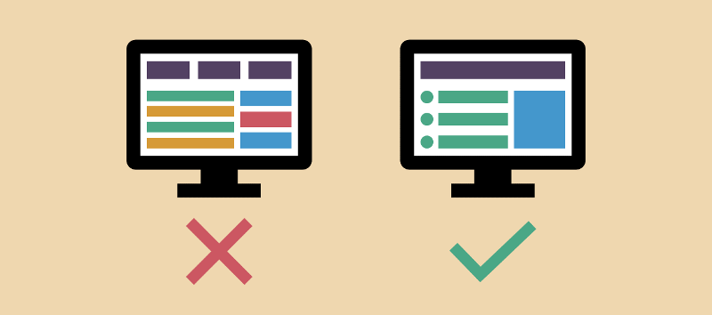
Design exaggeration is a common mistake committed by developers who want to offer an extremely fancy portal. Users, especially learners, don’t want flashy colors and hardcore animations in their learning platform.
Try to keep it elegant, easy-to-navigate, and free of any complexities. You can consult with your UI designer to build a learning portal that impresses the audience with its ease-of-access and high user-convenience.

Avoid the practice of “assuming” stuff.
Create your e-learning platform that’s completely transparent and ensure that any feature visible to you should also be visible to the learner. By thinking from a learner’s perspective you can formulate a harmonious UI design that’s super convenient for the visitor.
3. Maintain Platform Consistency
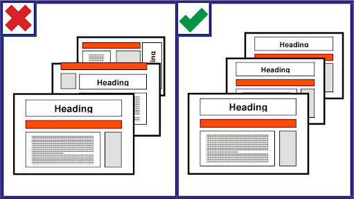
It’s critical to maintain a homogeneous interface layout throughout your e-learning website or application. There should be consistency in terms of buttons, color scheme, and overall navigation experience.

The image above is the perfect example of maintaining portal consistency.
Don’t confuse the learners by changing colors frequently or altering the position of buttons. Align all the pages with the same layout so that users become comfortable with your platform.
For e-learning businesses, color gradients play a vital role in providing convenience to the learner. Keeping your UI design the same as globally accepted features is another aspect of having platform consistency. For example, the universal color schema for a right and wrong answer is green and red, respectively.
4. Build a Responsive and Compatible UI
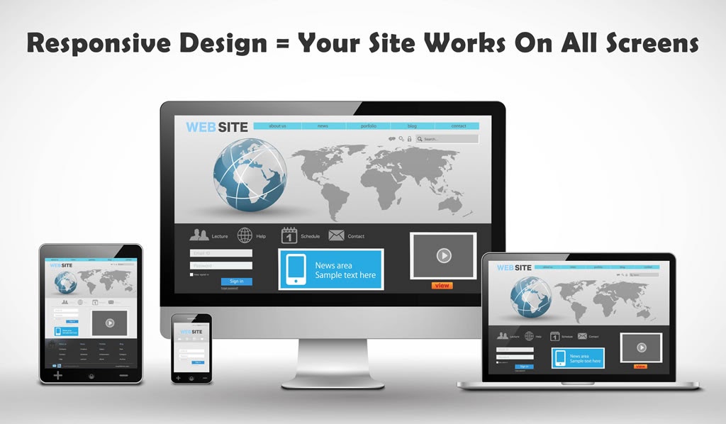
Mobile phones are now the primary drivers of global internet traffic. A recent study by CioDive informs that almost 70% of the total internet traffic comes from mobile phones. So, your e-learning venture must be equally responsive to the smaller screen as well.

Today, people want to learn on-the-go, and their most convenient option is a mobile phone or tablet. Learners won’t think twice before saying “goodbye” to your portal if it doesn’t function properly on their smartphone.
Structure the UX design separately for numerous digital devices to offer a smooth navigation. Designers develop “lite” versions to provide users with a super-quick and easy-to-access platform. You can follow a similar approach to improve the performance of your e-learning application.
5. Implement UI/UX Testing before Deployment
It’s critical to run multiple UI/UX tests for your E-learning platform that evaluates its functioning, ease-of-usage, and performance. It reduces the risk of losing out on conversions and monitors the cost of post-deployment modifications as well.
With an effective UI/UX testing you will stay ahead from your competitors. A recent survey conducted by SkyHook informs that only 55% of the businesses execute proper user experience testing.
User feedback is critical. But relying entirely on customer feedback is not a wise man’s decision. This is because, as per BeyondPhilosophy, almost 91% of the customers don’t complain about their issues and never return to the platform.
To Conclude
UI/UX plays a pivotal role in the digital world especially for edtech product-line.
To boost the performance of your learning portal, formulate the product blueprint after an in-depth research.
Deploy an elegant UX design and avoid a repulsive and complex interface that’s hard to navigate for the learner. Be consistent with the design and follow a homogenous approach when aligning buttons and pop-ups.
Ensure that the learning platform is compatible with smartphones, tablets, along with PCs. Present the best version of the E-learning portal after successive UI/UX testing that evaluates its performance and functioning.
You can share your thoughts in the comments section, and if you’re interested in writing a guest post for us, please click here.