How to design your first set of Icons

Have you ever had that fear of designing your first set of icons?
Icon Designing may not take you long but what actually grips your mind is how to start? There are a series of thoughts that keep making rounds in your head, as what should be the underlying theme or what should be the color scheme?
There is no doubt about the fact that the first step is always the hardest. And, it is also the most effective. How about starting small? Starting for yourself or for fun!
Yes! let your first set of icons be not for the clients or for any commercial purpose. Let it just be for fun. Get your hands on it first before you produce your first commercial masterpiece, designed just to knock everyone off the feet!
Let us make things easy and try to iron out the complexities of the process.
To begin with, it will be interesting to know what an icon actually stands for?
What is an Icon?
We all have seen icons flooding our screens and have used them immensely. Coming up with revolutionary icon designs that will just take your whole game to a new high, if you spend some time reflecting on what an icon basically does, it will really help clear a lot of air in your head.
An icon from a digital aspect is a graphic representation of a program, an option of a window on the screen. The first set of icons was designed in 1981 by David Canfield Smith and Norman Lloyd Cox had come together to design the GUI for Xerox Star 8010. Entrusted with the task to make user interaction easier, they came up with these compact symbols of fun. These icons were then set to be a reflection of real objects to which a user could relate to. Inspiration seemed to have come from the everyday office objects as computers at that time were restricted to offices.
Hence, the ground for the most advanced and popular GUI was laid, unknowingly.
Why do you think, they became popular?
Icons as we see them today almost stand to serve the same functions for which they were conceptualized almost 38 years ago.
- Easier Interactions: Icons made the user interaction with the software and devices more fun and easier. They have become so integrated into our daily lives that even imagining GUI based out only on keywords is scary.
- No Language Restrictions: Icons are universal in appeal. They needed no language to be comprehended as the symbols were picked from everyday objects. They came as a convenient mode of conveying the same information to users who came from different parts of the world.
- Speed up Thought Process: We all know that images are a better mode of conveying the message. Icons effectively help to stimulate the thought process faster to significantly bring down the time of engagement.
- Visually Appealing: Even if you keep aside the aspect of functionality, the icons do also come loaded with a visual appeal that cannot be ignored. Great icon designs act as awesome visual triggers.
Now you know where is it all coming from. How did icons make it to such heights in popularity? Now you also probably are close enough to design your own icon design.
Let us then begin!
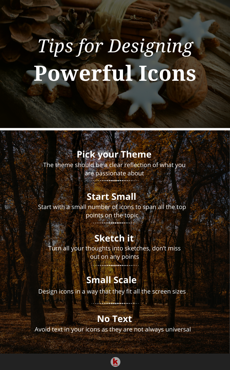
- Pick your Theme: Here is your primary give-away and it should be a clear reflection of what you are passionate about. This is important as it will keep your interest level high and you will be more productive. Now, do not get started with your icon design with mundane topics like household items, or your routine, etc. Pick up the one that really triggers your imagination. This will not only make it more fun but also you will have no shortage of ideas working on it.
- Start Small: Do not overdo it. Keep it basic and keep it small. This means do not start with a hundred icons, to begin with. The reason being you will possibly burn out much before you have reached even half of it. Is there any ideal number? Well, start with 5 or 6. These are just enough to span all the top points on the topic. Now if you feel this is a somewhat small number but understand this will not seem like a small number when you design 6 of them that will go with one another.
- Sketch It: As you conceptualize, keep sketching. This will not let you miss out on even the slightest thought that will hit your mind. Next, the best thing is to pick the ones that most fit your frame. Do not jump to the illustrator. Stick to basics-pen and paper. Every icon to be perfect needs at least 4-5 rough sketches.
- Small Scale: Remember your icons have to fit every screen size. For overcoming the blurry image problem, remember to test the icons on the smallest scale you have. This will give you an edge of being able to cover maximum details on a minimum scale. The real fight will be to go minimum yet keep it relevant and recognizable. These small-scale icons may not be very flashy but will be highly effective. And of course, you can always design the bigger ones which will be completely functional and attractive.
- Avoid Text: Avoid text in your icons. The reason is that texts are not universally recognized and different alphabets can have different connotations in different cultures. Hence for the proper perception of an icon, avoid any text.
Icon design is a strategic field but it is fun. If done right, you can get the untold visual perception. It can make the whole game easier and more enjoyable. Hopefully, this helped you in your quest for the perfect icon design strategy. Do share your experience.
Want to publish your content on the RedAlkemi blog? We accept and publish guest posts too! Check out our guest post terms.
